Update: 5 May 2011
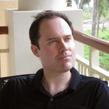
The trail of the lostargs.com poster ran cold for over a year, but this week exciting new information has come to light! At long last, proof that the poster did indeed make it onto the LOST production office wall! The photo below features Noreen O'Toole (associate producer), Cory Bird (assistant to Carlton Cuse), Claire's infamous squirrel baby, and hanging proudly on the wall in the background, the poster!


Update: 27 Jan 2010
 Above: thorsten received his copy of the poster signed by Damon and Carlton at Gallery 1988.
Original Post:
Something special happened during the first half of December 2009. The germ of an idea took root, was fed by the passion of many, became something beautiful, and found a home. I remain happily bedazzled by the events that transpired over those magical days. This is the story of the lostargs.com poster created in appreciation of the Lost Underground Art Project.
By the third day of December 2009 the latest Lost ARG, referred to as either the "Lost Underground Art Project" or "Damon, Carlton, and a Polar Bear" (DCAAPB), was nearly at an end. Fifteen Lost-themed screenprinted posters had been revealed, all fifteen had sold out. Two major events remained -- the unveiling of the sixteenth poster and a celebratory art show to be held the fifteenth of December at Gallery 1988 in Los Angeles. All sixteen posters would be on display at G88 as well as a raft (no pun intended) of additional Lost-themed artwork including paintings and sculpture. And that's not all! Also rumoured to be attending the show were key players from the Lost creative team including Damon Lindelof and Carlton Cuse, as well as several of the artists involved in the DCAAPB project.
As I started to pack my bags for LA, a grim realization slowly seeped in. A few obstacles stood between me and G88. For starters, a few hundred dollars for airfare and accommodation. Also the need for unplanned leave from work. And family commitments. Hmmm, guess I wouldn't be able to attend after all.
Born of this frustration and disappointment was a crazy idea. What if I, and others in my situation, could be there without actually being there? What if we created an image of us all, had it printed up on a few T-shirts, and asked some of our friends who were attending the G88 show to wear the T-shirt? As the thought popped into my head I posted it on lostargs.com, the preeminent website covering DCAAPB. I didn't get an immediate response from the lostargs crowd. Maybe, I thought, instead of creating a T-shirt we could print off a poster with images of the non-attending attendees, and have someone bring it to G88. Perhaps it could even be hung at the gallery beside the other posters, and/or given to Darlton as a gesture of appreciation for both the show and the DCAAPB project. I floated this new idea to the good people of lostargs.com. This time I received a several votes of support. Within a few minutes, thorsten had stepped forward and volunteered his services to create an image for the poster.
Very quickly the logistics were worked out. Anyone who wanted to be on the poster would send a jpg to thorsten. Then thorsten would work his Photoshop magic. Within a few days thorsten had received photos from dozens of lostargs.com readers. Nervous anticipation was in the air. A lot was on the line. Would we end up with a worthy work of art, or an ugly, disjointed mess. Should we have "hired" the first chap to volunteer, or would it have been more prudent to check credentials a little more closely? Who was this thorsten fellow anyway? A collect sigh of relief echoed through the blogosphere when thorsten unveiled the image. Fantastic!
Another member, ChrisL, volunteered to investigate print services in LA. Miraculously he found a shop with an employee who not only loved Lost, but was willing to shepherd (!) the poster's production to ensure it was on-time and done well. We decided on an 18x24 stretched canvas print, identical in size to most of the DCAAPB posters. ChrisL graciously offered to foot the $160 printing bill, but equally gracious LOST ARGs members wouldn't hear of it and many contributed to the cause. The notorious ReverendMilo, one of the more colourful members of the LOST ARGs community, also printed off a few additional 18x24 prints on his massive printer.
We also needed someone to bring the completed poster to the event. Enter Maven. The poster was couriered from the print company to Maven's home on Friday December eleventh, a full three days before the event. Maven reported that the print looked great in person. Things had gone so well so far. It was almost too good to be true.
The doors to Gallery 1988 were set to open at 7PM PST on Tuesday December 15, 2009. Maven arrived that morning to stake her place in line, with the lostargs.com poster (and her renowned hand-crafted Lost quilt) in tow. Affixed to the back of the canvas was an envelope containing two "indexed" posters identifying the fans featured in the collage. Shortly after one o'clock that afternoon the excitement level spiked as an ABC camera crew arrived. Maven excitedly tweeted that she had been interviewed and that she had the poster with her at the time. A warm glow radiated from the LOST ARGs community with the realization that their poster might seen in one of the season 6 DVD special features.
The arrival of the camera crew shifted the day into high gear, but within an hour it was in overdrive. Damon Lindelof and Carlton Cuse arrived, rockstar-style, to say hello to the fans and give out some swag. Also present were Samantha Thomas and Noreen O'Toole from the Lost production team, and Jensen Karp (a.k.a. Tyson Givens) from Gallery 1988. Sam, Noreen, and Jensen were three of the key ARG-runners. The arrival was streamed live over the Internet courtesy of ReverendMilo. Those who couldn't attend in person watched as Carlton signed one of Milo's poster copies for thorsten. Then Damon and Carlton moved toward the head of the queue where Maven stood ready and waiting with the official lostargs.com poster. After signing a few more items and handing out some swag, Damon and Carlton were presented the poster. Jacob...er sorry I mean Damon touched the poster lovingly and both men took a few seconds to check out the many fans present in the photo collage and the artistry of thorsten's presentation. Although it cannot be verified with certainty, it is thought that squeals of joy could be heard on each of the major continents around the globe.
Shortly thereafter the Lost team said their good-byes as they set off to work, promising to return for the opening at 7PM that evening. True to their word they were back that evening, signing autographs, smiling for photos, being interviewed by various media outlets, and chatting with the fans. Once again the action was streamed live to those who couldn't make the show, this time by ReverendMilo and LotteryTicket.
The precise journey taken by the lostargs.com poster after the presentation to Darlton is shrouded in mystery. (Dang it, we should have affixed a GPS to the back of the poster!) We suspect that it may have been taken by Noreen or Sam that afternoon, or perhaps was taken by Jensen and kept at the Gallery1988 backroom for some time. The day following the Gallery 1988 event was a bit of a blur as tired out-of-town attendees drove or flew back to their homes, and others monitored various websites and analyzed clues trying to divine the time at which the final poster would be available for purchase. Maven delighted the masses by letting us know that Darlton had said he would hang the poster in the Lost writers' room. The thought that many of us would be "watching" as the Lost writers completed the last few episodes of the series... To quote Hugo Reyes -- "Whoa!". Of course (and no disrespect to Darlton) LA talk can sometimes be just that. Fortunately Maven had also chatted with other members of the Lost production team and asked them to keep Darlton honest! Perhaps that S6 DVD special feature will have multiple appearances by our poster. In fact, (start Jedi mind trick) the poster will have its own dedicated special feature on the S6 DVD. And will have its own spin-off series. (End Jedi mind trick.) If only I were a Jedi. And Jedis were real.
The most recent lostargs.com poster update arrived from comixguru on the afternoon of Thursday the 17th of December. She had visited Building 23 on the ABC lot (where the Lost writers work) to drop off a card, and as she left had noticed something very familiar waiting patiently on an office desk. Yes, indeed, the lostargs.com poster. Not quite up on the writers' room wall yet, but undoubtedly on its way there.
Many fan communities are renowned for their passionate dedicaton to their favourite obsession. Through this experience I discovered that the Lost fans who form the LOST ARGs community are not only passionate but also generous, organized, artistic, focused, talented, and efficient. Looking back it is amazing to realize that within two weeks the poster went from a crazy trial balloon floated on the Internet to a polished work of art sitting in the Lost production office! Equally amazing -- the fact that the story of the lostargs.com poster is only one of dozens of incredible memories associated with the Lost Underground Art Project.
Many people were involved in the creation and delivery of the lostargs.com poster. Thanks to each who contributed in some way, big or small. Particular thanks to:
- thorsten for his artistry
- ChrisL for making it real
- maven for presenting
- comixguru for raising the profile
- ReverendMilo for streaming
- LotteryTicket for connecting names and faces
- and zort for giving us a home
Visual History:
Above: thorsten's masterpiece is unveiled on lostargs.com.

Above: maven has received the poster!

Above: maven displays the poster while in line at Gallery 1988.

Above: Carlton signs a copy of the poster for thorsten.

Above: Darlton are mobbed as maven patiently waits.

Above: Damon and Carlton talk with the fans.

Above: Damon and Carlton hand out swag. Sam & Noreen are behind them.

Above: maven waiting for the right moment to rotate the poster into its upright position.

Above: That's better. Now thorsten's artistry catches Carlton's eye.

Above: Damon too is fascinated with the piece.

Above: maven relates the story of the lostargs.com poster.

Above: The poster in the Lost production office. Next stop: writers' room!
 Above: Connecting names and faces. Courtesy LotteryTicket.
(Left-click to embiggen. Then right-click to save)
Timeline:Thursday, 3 December, 8:53AM EST@RobPerrin suggests creation of T-shirt featuring photos of lostargs.com members as a means to "virtually" attend the Gallery1988 opening
Thursday, 3 December, 9:01AM EST@RobPerrin revises proposal -- perhaps a poster rather than a T-shirt? It could then be presented to TPTB as a token of our appreciation for the show and the latest ARG.
Thursday, 3 December, 9:19AM EST@thorsten agrees that lostargs.com should have a poster and that it should be presented to TPTB at the Gallery1988 opening.
Thursday, 3 December, 9:28AM EST@kiwilostie asks thorsten if he would be willing to help create the poster .
Thursday, 3 December, 9:31AM EST@thorsten heartily agrees to contribute his Photoshop skills to the cause.
Thursday, 3 December, 9:45AM EST@thorsten invites all to email their jpegs to him. The game is on!
Friday, 4 December, 11:23AM EST@zort70 creates a post on lostargs.com publicizing the poster and echoing the call for photo submissions
Saturday, 5 December, 11:00AM EST@ChrisL posts that he has started looking into LA print shops.
Sunday, 6 December, 1:54PM EST@ChrisL suggests printing on 18x24 stretched canvas using digitalroom.com. He offers to cover the cost. Also asks if anyone is willing to have the poster delivered to them.
Sunday, 6 December, 2:54PM EST@maven agrees to have the poster delivered to her home, and to bring it to Gallery 1988 on opening night.
Tuesday, 8 December, 3:51AM EST@thorsten announces that he has finished creating the poster image!
Tuesday, 8 December, 4:31AM EST@zort70 creates a post showing thorsten's poster image. The crowd roars!
Tuesday, 8 December, 1:16PM EST@ChrisL has found a LOST fan at the print shop (UPrinting.com, affiliated with digitalroom.com) who will ensure the poster is taken care of. @ReverendMilo has also received the poster jpg, and will print backup copies on his monster printer. @ChrisL reiterates he is willing to cover the cost of $160, but due to popular demand provides a PayPal account for contributions (max $5 each)
Wednesday, 9 December, 5:22PM EST@ChrisL announces that he has been inundated with contributions to his PayPal account. He decides to donate the contributions to charity.
Friday, 11 December, 10:53AM PST@maven indicates that she has received the poster and posts a youtube video. She declares it is even more wonderful in person.
Saturday, 12 December, 11:14AM EST@JustThinking suggests that it would be great if Amy Lynn could create another of her wonderful rhymes which could be affixed to the poster.
Saturday, 12 December, 11:34AM EST@AmyLynn agrees to give it a go.
Saturday, 12 December, 9:32PM EST@comixguru let's us know that she has given Noreen (key DCAAPB champion from the Lost production team) a heads-up about the poster
Monday, 14 December, PM PSTThe line begins to form for the Galley 1988 Lost Underground Art Project opening night!
Tuesday, 15 December, 10:00AM PST@maven announces she is in the lineup for Gallery 1988.
Tuesday, 15 December, 1:29PM PST@Eugene relays @maven's tweet indicating she was interviewed by a DVD crew and she had both the poster and her famous Lost quilt with her! The poster may be featured on the Lost S6 DVD!
Tuesday, 15 December, 2:17PM PSTCarlton autographs one of ReverendMilo's copies of the poster for thorsten!
Tuesday, 15 December, 2:20PM PSTA video stream from @ReverendMilo records for posterity the historic presentation of the lostargs.com poster to Damon and Carlton.
Wednesday, 16 December, 11:44AM PST@maven reveals that Darlton said they will hang the poster in the Lost writers' room. Gulp. And that maven later instructed Gregg Nations and Carlton's assistant to ensure the promise is kept. In summary: maven rocks!
Thursday, 17 December, 1:11PM PST@comixguru tweets (with photo) that the poster is sitting on a table at the Lost offices in Building 23! Soon to be mounted in the writers' room, no doubt! (Either that, or destined for use as an upscale coaster.)
The FutureAnything is possible!


 Above: thorsten received his copy of the poster signed by Damon and Carlton at Gallery 1988.


 Above: Connecting names and faces. Courtesy LotteryTicket.